题库 / EAOfficialPractice-GI-142

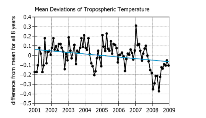
The graph shows monthly temperature data, in degrees Celsius (°C), about the Earth’s troposphere as measured by Satellite X. It presents the mean for the month less the mean for the entire 8-year period. The graph also includes a line of best fit for the data points shown.
For each of the following, use the drop-down menu to create the most accurate statement on the basis of the information provided.
To evaluate the conclusion that Earth’s mean tropospheric temperature declined over the 8-year period shown, it would be most helpful to see a more comprehensive graph of the same period of time that showed .
The conclusion that Earth’s mean tropospheric temperature declined over the 8-year period shown would be most weakened if the set of measurements in were revised toward the current line of best fit.